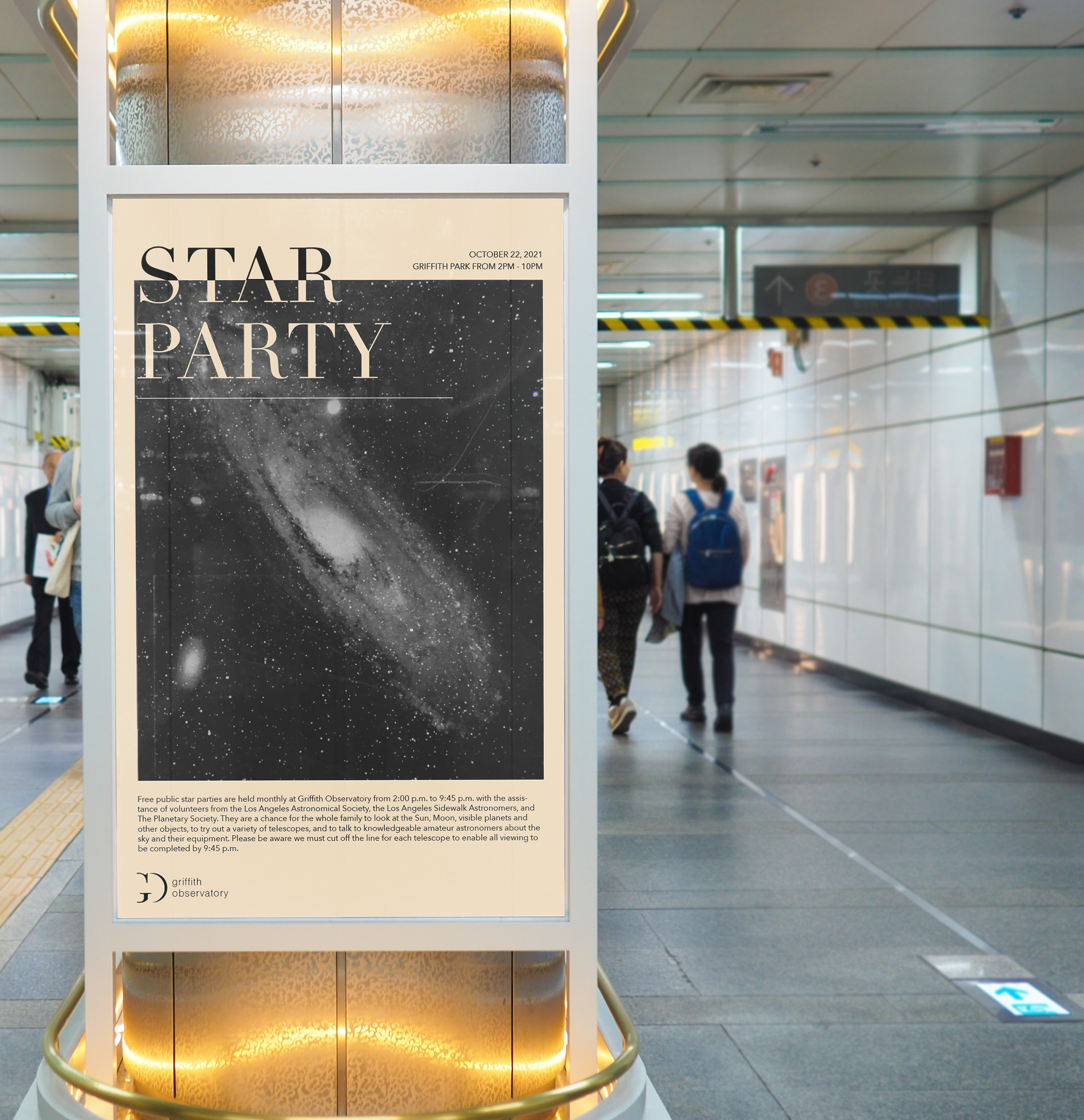
Griffith Observatory Brand Expression
I chose to rebrand the Griffith Observatory in a way that would capture the iconic feel that it has sitting in the heart of Los Angeles. The Observatory is a historical landmark that many celebrities look to live near and people travel far and wide to see. I wanted to create a rebrand that would encapsulate the culture of learning while also giv- ing it a new fresh, modern take on space. I wanted the brand to feel very light, airy, and “spacious” if you will.
Ideation
I wanted the logo to represent the feeling of space while also resembling the unique architectural structure of the observatory. The “G” and the “O” were both great shapes to work with in order to give off the feeling of space and negative shapes.